My 5 favorite PSB album covers
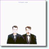 |
1. Actually Photographer - Cindy Palmano; Design - Mark Farrow and Pet Shop Boys For the reasons that I cover quite nicely in my main entry for the album, if I do say so myself. |
 |
2. Very Design - Pentagram, Mark Farrow, and Pet Shop Boys A very close second: incredibly innovative, and just as incredibly eye-catching. I couldn't help but feel I was buying something special when I brought it up to the record-store cashier. It also made me nostalgic for my childhood Lego™ set. It's a pity—understandable, but a pity nonetheless—that the original design is no longer available in new copies of the album, having been replaced by a mere photo of the original packaging. For newer fans, it's why you should haunt shops that sell used CDs. More than a quarter-century later, I still see copies in such stores quite often, half-disbelieving that people would willingly part with them. |
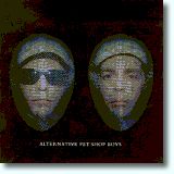 |
3. Alternative Photographer - Richard Burbridge; Design - Mark Farrow Design
|
 |
4. Bilingual Design - Mark Farrow Design and Pet Shop Boys As with the music contained within, my estimation of this album's cover has grown considerably with time. For years I simply regarded the frosted jewel case as a poor relation to the almost incomparable one for the immediately preceding studio album, Very. But now, with time, I'm far better able to appreciate it on its own terms. Like Very and Alternative, it exemplifies how the Pet Shop Boys were determined in the mid-nineties to experiment with and push the boundaries of CD packaging, giving their fans more than their money's worth not just in music, but in the graphic arts as well. |
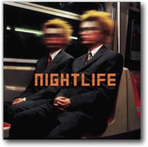 |
5. Nightlife Photographer - Alexei Hay; Design - Mark Farrow Design and Pet Shop Boys Photographed on the New York Subway system, this cover art shows Chris and Neil exhibiting a variation on the distinctive "look" they adopted for the album and its accompanying singles and videos. I personally regret that the decision was made to blur their faces, which (in my opinion) detracts from the effectiveness of the image. Mark Farrow has said that he "would have been happy to go with the pictures as they were, because they were quite striking," but the unaltered photos reportedly "offered an unsympathetically intimate view of their new look." I'm really not sure what's meant by that, except maybe that somebody felt it just didn't look good. Faulty makeup, perhaps. The blurring does, however, add an air of mystery. It invites you to ask "Why?"—the answer to which may be much more mundane than one would imagine. But then it's the imagining that counts. |
All text on this website aside from direct quotations (such as of lyrics and of other nonoriginal content) is copyright © 2001-2024 by Wayne Studer. All Rights Reserved. All lyrics and images are copyright © their respective dates by their respective owners. Brief quotations and small, low-resolution images are used for identification and critical commentary, thereby constituting Fair Use under U.S. copyright law. Billboard chart data are copyright © their respective dates by Billboard Media, LLC.